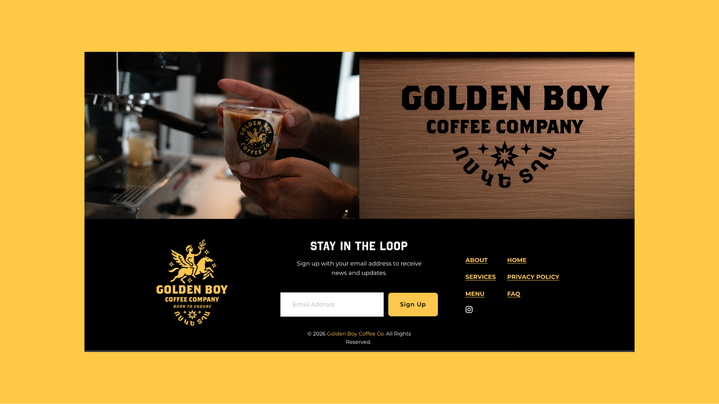
GOLDEN BOY COFFEE CO.
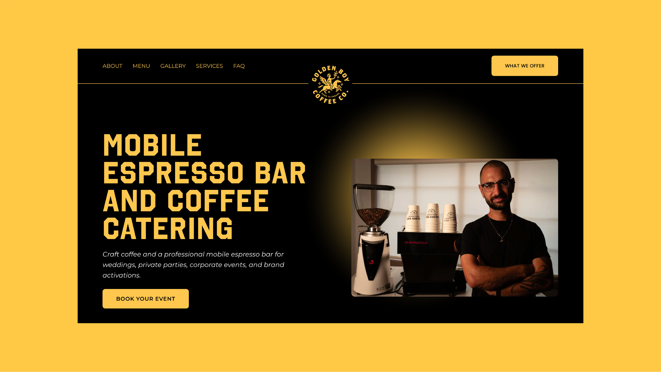
Golden Boy is a teacher-owned mobile espresso bar that brings authentic coffee-shop drinks to weddings, schools, corporate events, brand activations, and wherever else people deserve something better than a lukewarm airpot on a folding table.
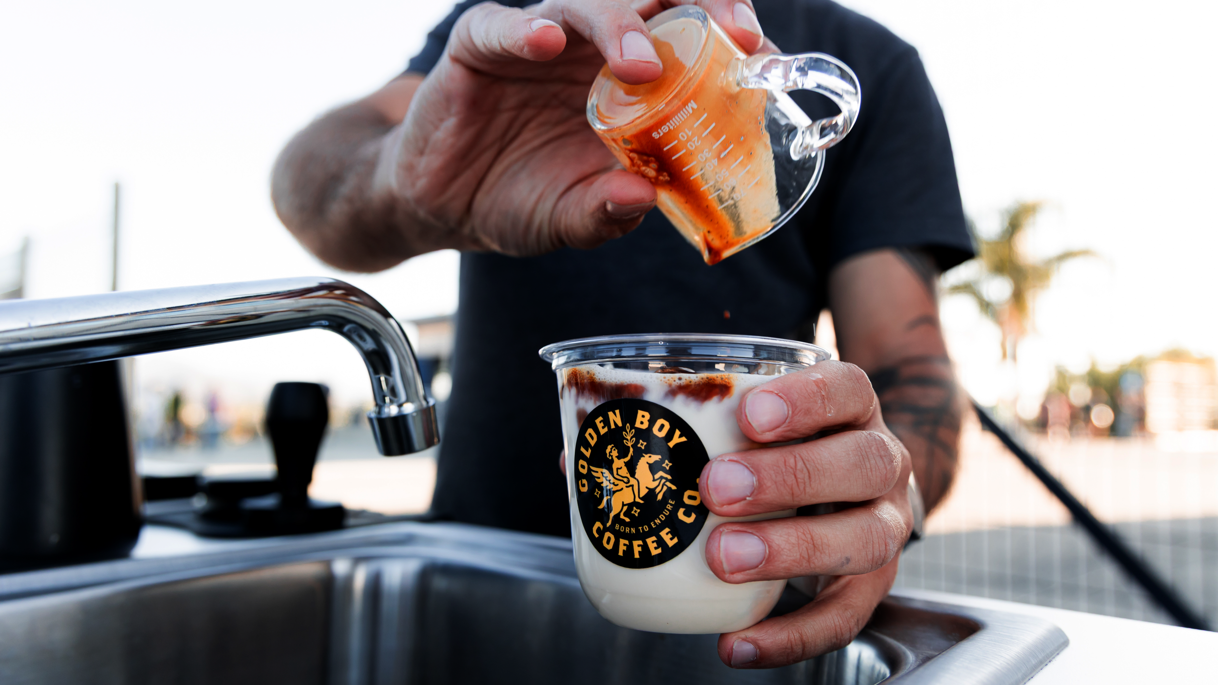
THE WORK
Art Direction / Brand Identity / Packaging / Website Design
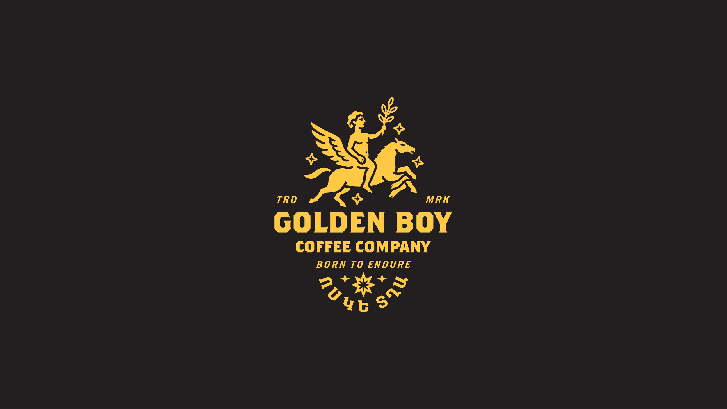
THE LOGO
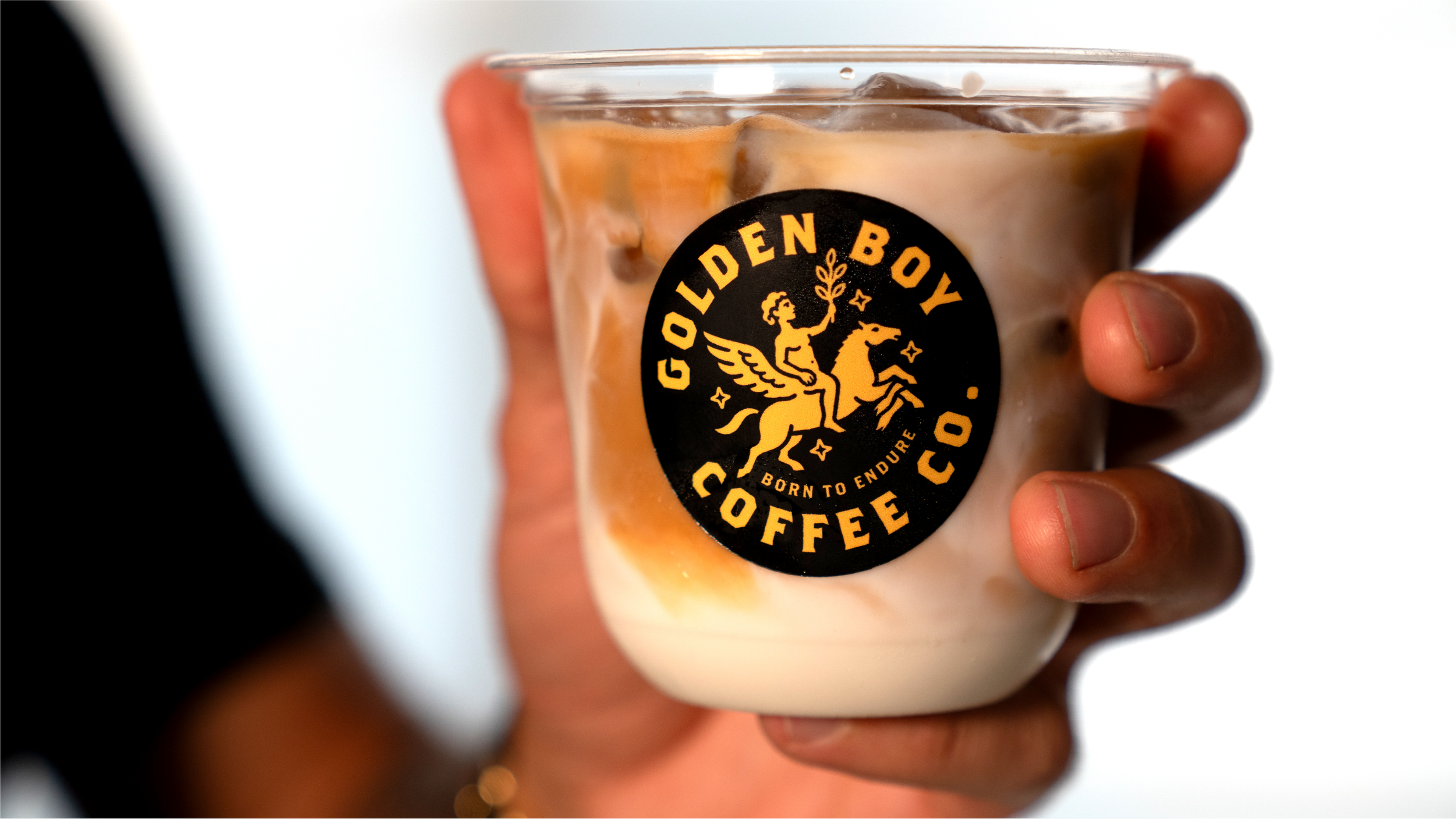
The Golden Boy identity was built around optimism, endurance and a little mythology.
We wanted the brand to feel like it had existed forever, while still carrying the energy of someone starting something completely new.
At the center is the Golden Boy himself, riding forward with a winged horse and olive branch in hand. The imagery speaks to movement, growth, resilience and the idea of chasing something worth believing in. It felt especially fitting for a brand rooted in Gilbert’s Armenian heritage, his work as a teacher, and his belief that the dreams we carry when we’re young are still worth following later in life.
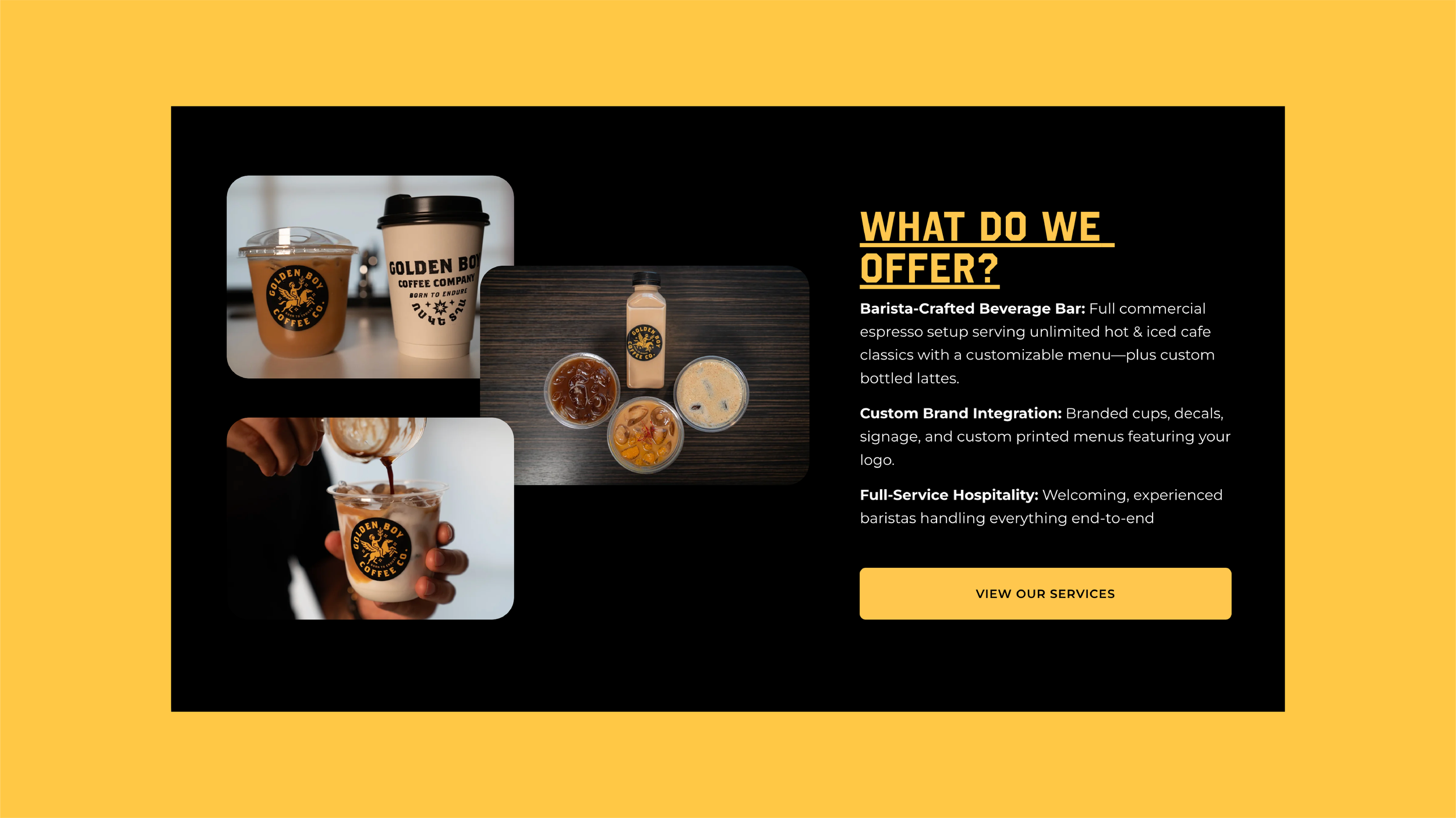
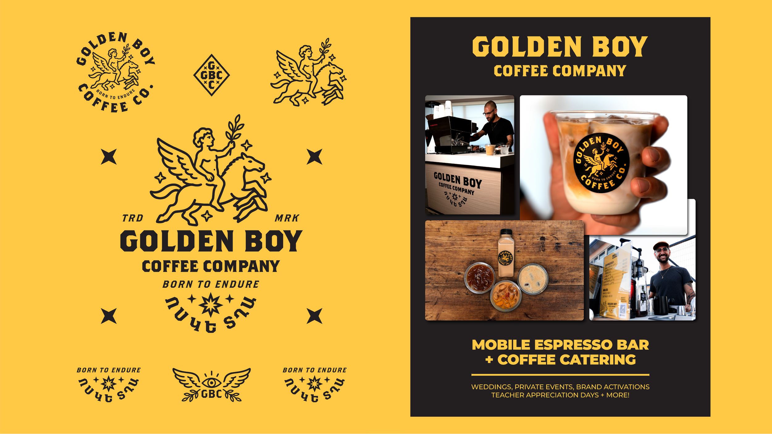
We paired that old-world, almost ceremonial imagery with bold typography and simple graphic elements to keep it approachable, energetic and useful in the real world. Coffee cups, carts, stickers, shirts, bottles, menus. It needed to work everywhere.
Born to Endure.
A reminder that growing up doesn’t mean letting go of the things you once imagined for yourself. Sometimes it just means finally going after them.
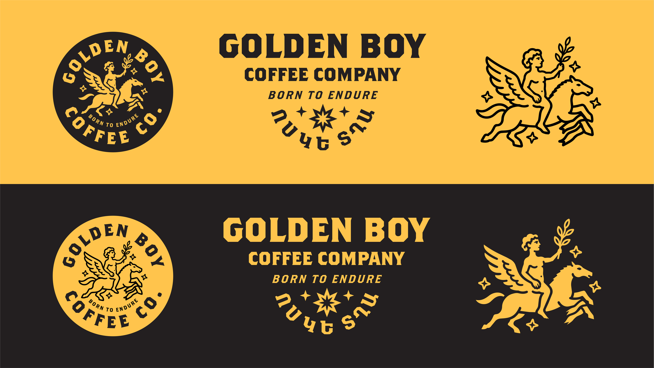
COLOR THEORY
We wanted Golden Boy to feel warm, established and optimistic without falling into the usual coffee-brand palette of browns, creams and earthy greens.
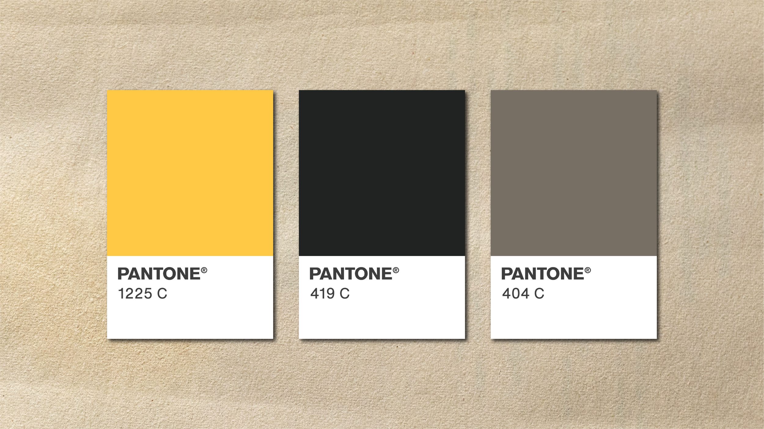
Pantone 1225 C became the heartbeat of the system. It carries the warmth of California light, the optimism behind the Golden Boy name, and just enough nostalgia to feel like something you might have seen painted on an old gym wall, café sign or neighborhood storefront decades ago.
Pantone 419 C gives the brand its weight. Nearly black, but softer and more human than a true black, it grounds the brighter yellow and gives the identity the toughness and permanence behind Born to Endure.
Pantone 404 C sits quietly between the two. A muted, stone-like neutral that brings in a little age, heritage and restraint when the system needs to breathe.
Together, the palette feels sun-worn, sturdy and familiar, with one foot in the past and the other very much in the present.
And most importantly, it doesn't look like every other coffee company.
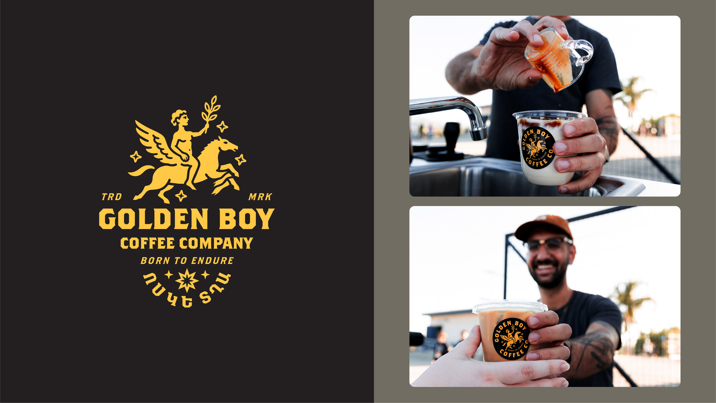
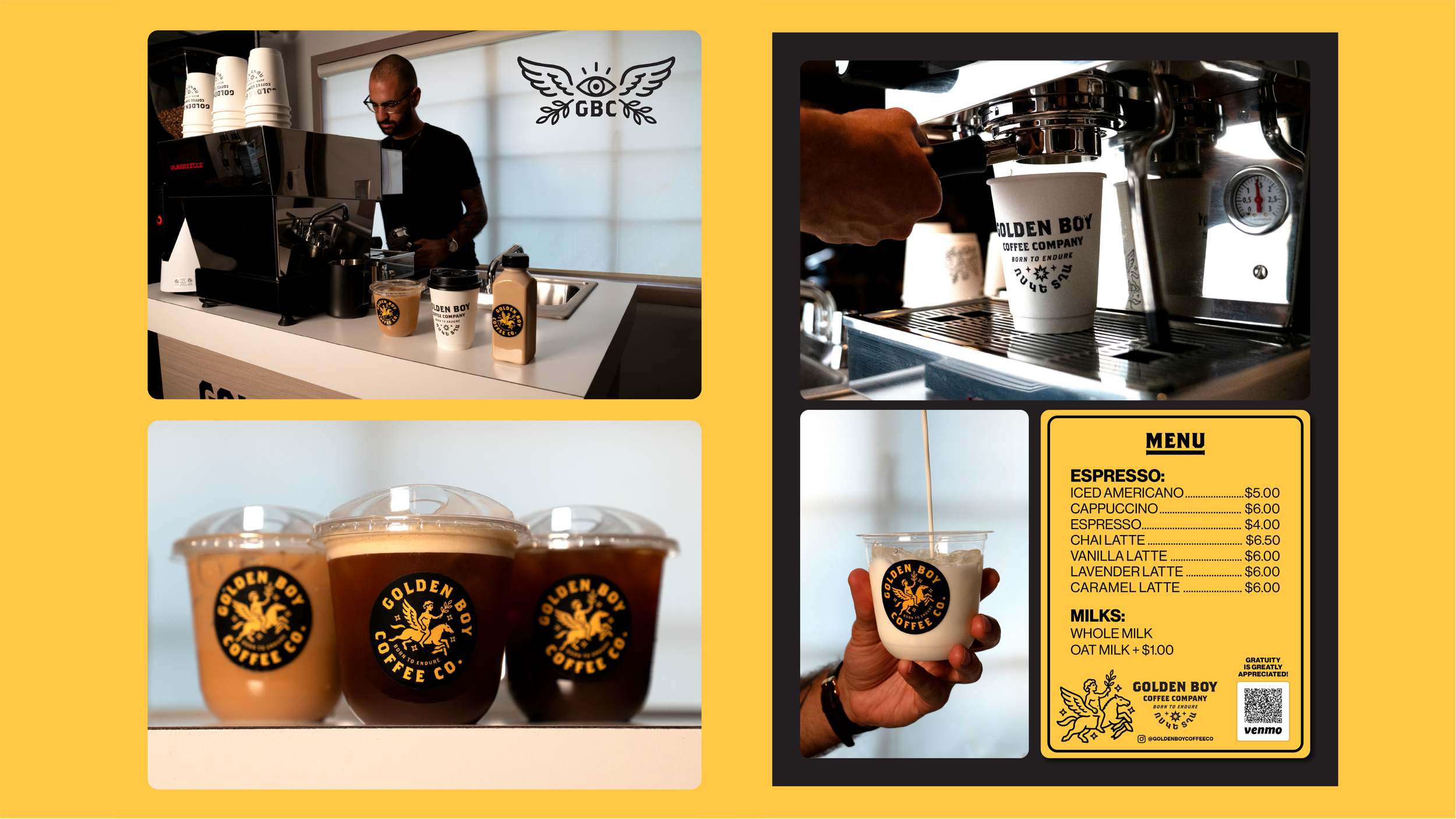
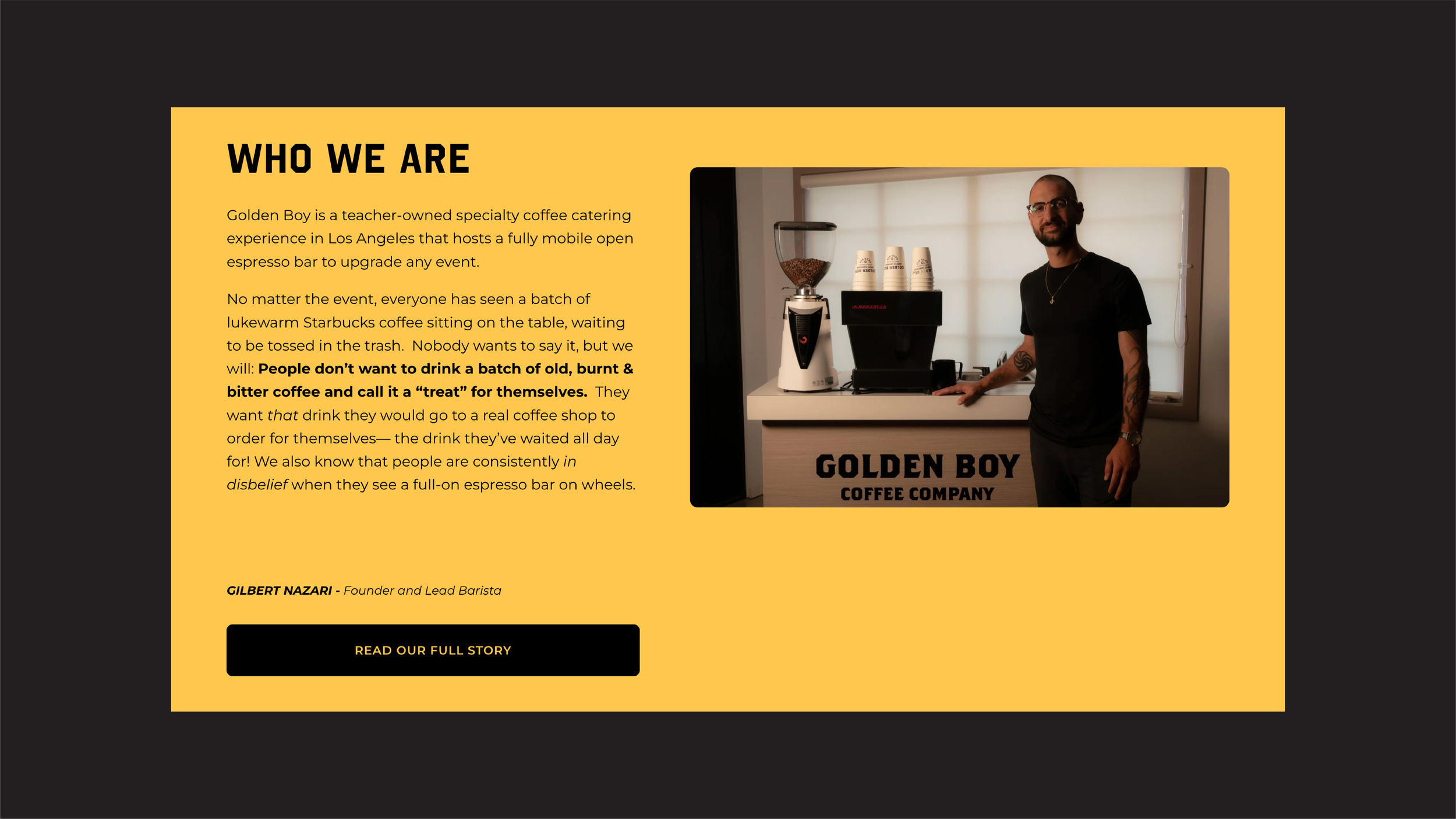
Golden Boy started with our friend, Gilbert Nazari, a music teacher in Los Angeles who began making better coffee for fellow teachers tired of whatever sad Keurig situation was happening in the break room. People kept coming back, Gilbert realized he loved the hospitality side of it, and eventually that small ritual turned into Golden Boy Coffee Co.
But there was always more behind the idea than coffee. Gilbert wanted Golden Boy to reflect his Armenian heritage, his life as an educator, and his belief that a business could eventually help create more access to music, arts and literacy for young people. Coffee became the vehicle for something bigger: community, hospitality and giving people a reason to come together.
We worked with Gilbert to build the world around that idea, developing the brand identity, packaging, labels, merchandise, menus and supporting visual system. The identity pulls from heritage, mythology and a little bit of youthful optimism, anchored by the Golden Boy himself and the line “Born to Endure.”
The goal was to make something that felt established without feeling old, personal without becoming overly sentimental, and bold enough to work everywhere from a tiny coffee sticker to the side of a full mobile espresso bar.
Really good coffee. A flying horse. A little Armenian soul. And a much bigger purpose behind the cup.